Dark Arts Coffee’s Bold Packaging And Branding Redesign

Dark Arts Coffee’s Bold Packaging and Branding Redesign
abduzeedo1217—24Explore Dark Arts Coffee’s branding project by NOT Wieden+Kennedy, blending Joyful Nihilism with bold packaging design and collectible design.
Dark Arts Coffee, known for its irreverent personality and cult following, embraces a fresh yet consistent visual identity and packaging design. The London-based roasters partnered with design agency NOT Wieden+Kennedy to refine their bold aesthetic while introducing a new collectible twist—making coffee an experience beyond the cup.
Retaining Personality, Enhancing Structure
The redesign centered on maintaining the brand’s eclectic and dark humor-laden voice while introducing structure. Drawing inspiration from the company’s original signage—featuring occult symbols and darkly playful messages—NOT Wieden+Kennedy developed the concept of “Joyful Nihilism”. This guiding principle ensures the brand’s irreverence thrives without veering into chaos.
A key visual anchor in this evolution is the use of Cooper Black font. Combined with a refined color palette and updated iconography, the identity balances visual consistency and personality. The result is an identity system that is both scalable and instantly recognizable.
Packaging: A Playful Collector’s Dream
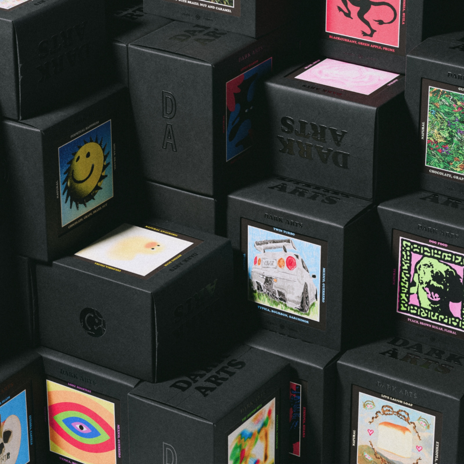
The standout element of the redesign lies in the packaging. Each of Dark Arts Coffee’s 100+ variants now comes with a collectible card visible through a window in the box. These cards feature:
- Unique artwork for each coffee
- Tasting notes
- Information about the coffee’s origin and roasting process
Fans have already compared the cards to Pokémon collectibles, adding a layer of excitement for coffee aficionados. At launch, NOT Wieden+Kennedy created over 50 card designs, with plans for ongoing collaborations with artists and brands. This approach gives the packaging a dynamic, ever-evolving nature while fostering customer loyalty.
Beyond Packaging: Brand as Experience
Dark Arts Coffee isn’t just a coffee company; it’s becoming a lifestyle brand. Through social media, merchandise drops, and now their collectible cards, they’ve built an experience that feels tactile and personal. The redesign further cements this position, appealing to loyal fans while creating a platform for global recognition.
NOT Wieden+Kennedy’s work on Dark Arts Coffee highlights the power of a well-executed branding and packaging design. By balancing consistency with creativity, they’ve ensured the brand’s core personality shines through while creating a visual identity that is ready for global expansion.
Discover more about the designers: NOT Wieden+Kennedy.
Branding and packaging design artifacts


