Flippo Pet Food: A Fresh Take On Branding And Packaging Design

FLIPPO Pet Food: A Fresh Take on Branding and Packaging Design
abduzeedo1111—24Discover FLIPPO Pet Food’s playful branding and clean packaging design, making waves in the pet food industry.
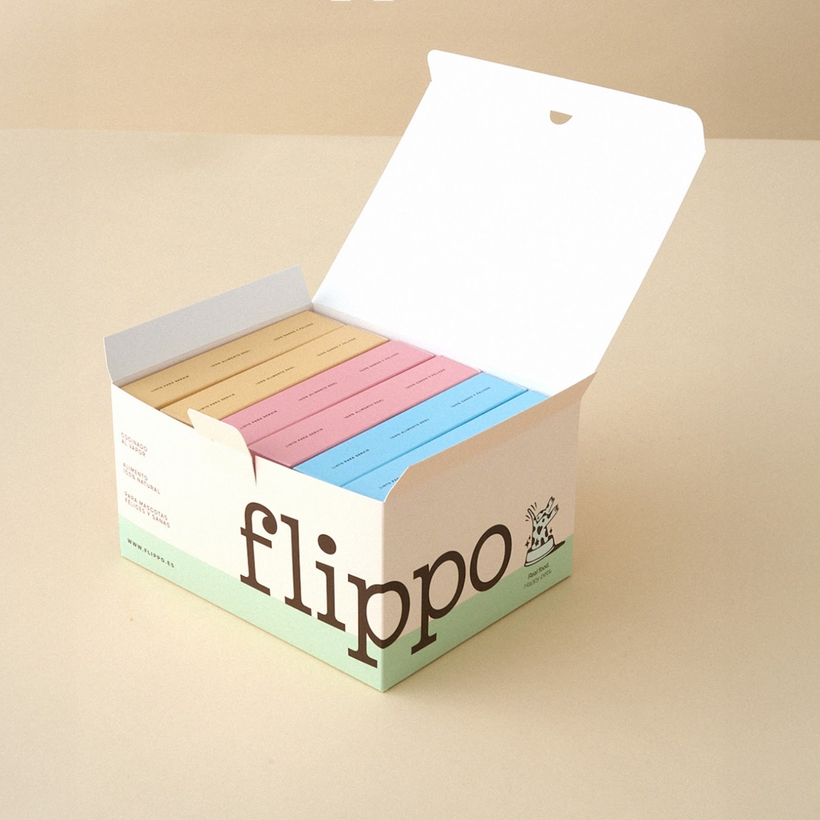
FLIPPO Pet Food is more than just a brand; it’s a lively celebration of real, natural nutrition for pets. Developed in Spain, FLIPPO takes a bold stand against traditional pet kibble, ushering in a wave of wholesome, fresh ingredients for our loyal companions. This design-centric approach comes to life through FLIPPO’s unique branding and eye-catching packaging, crafted by the talented team at invade design, Colombia.
A Visual Feast for Pet Lovers
FLIPPO’s brand identity is anything but conventional. It combines playful illustrations, vibrant colors, and friendly typography to create an experience that instantly captures attention. The visual storytelling here is intentional, aimed at communicating the brand’s commitment to quality and its promise of real food for pets. The design invites pet owners to rethink what they feed their furry friends, making every interaction with the packaging memorable.
One of the standout features of FLIPPO’s design is its use of clean lines and engaging illustrations. Each packaging element feels like an invitation to a healthier, happier lifestyle for pets. The color palette bursts with energy, reflecting the brand’s fun and light-hearted personality while reinforcing its serious commitment to pet health.
Thoughtful Typography and Brand Messaging
Typography in FLIPPO’s design strikes a fine balance between playful and practical. The brand uses bold, easy-to-read fonts that ensure key messages are clear, whether they’re displayed in store aisles or in a social media feed. This typographic choice complements the visuals, making the overall design both appealing and accessible.
Brand messaging leans into humor and relatability. FLIPPO’s playful copy engages pet owners with a tone that’s both fun and genuine. It’s a reminder that feeding our pets shouldn’t be a chore but a joyful experience, one that prioritizes their well-being.
From Concept to Reality: Behind the Scenes
The team at invade design worked meticulously to craft an identity that stands out in the competitive pet food market. Photography by Serena.Studio captures the freshness and quality of the ingredients, enhancing the appeal of the design. Together, these elements create a brand ecosystem that feels cohesive and authentic.
For those interested in design inspiration, FLIPPO offers a masterclass in branding and packaging that balances fun with function. Check out the full project and more by invade design on Behance at https://www.behance.net/madebyinvade.
Branding and packaging design artifacts
Credits
- Identidad de Marca:
- invade, Colombia
- Team:
- María Vélez
- Agustin Hoyos
- Mariana Castrillón
- Tania Flórez
- Tomás Saldarriaga
- Mateo Ríos
- Fotografía:
- Serena.Studio


